Tag: mobile-first website

  • Coaching Website Redesign | Soulfully WordPress Case Study

    Coaching Website Redesign | Soulfully WordPress Case Study

    How we rebuilt Soulfully's coaching website with fresh branding, cleaner layout, and a mobile-first design that outperforms desktop. Full case study.

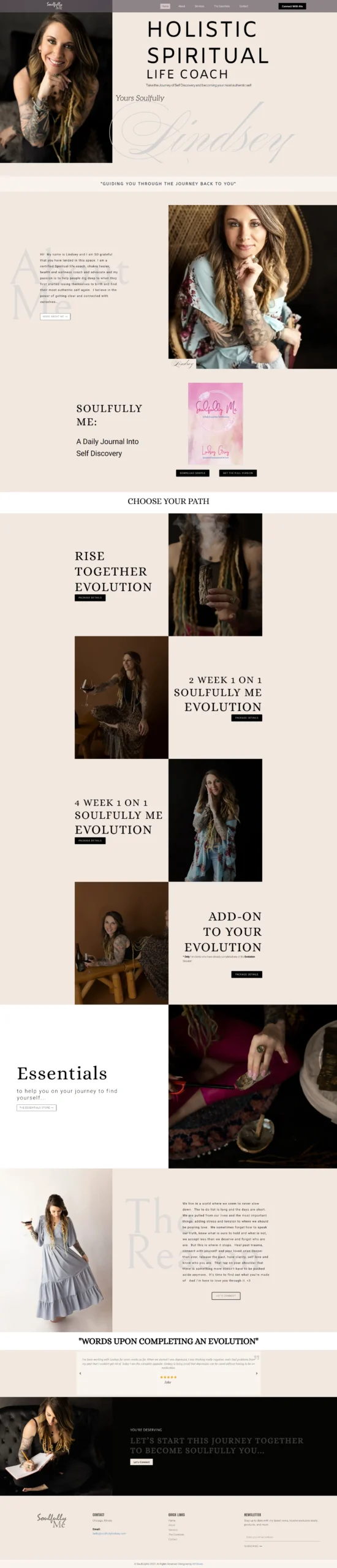
    Quick Answer: Soulfully is a coaching and counseling practice that needed an upgrade to their website design and branding to improve visibility and trust. We rebuilt the site with fresh branding, a cleaner layout, and a mobile-first design that looks even better than the desktop experience. This case study breaks down what we built and why it works for coaching and counseling practices.


    Coaching and counseling is a trust-first business. Before someone books a session, they need to feel that the practitioner understands them, that the practice is credible, and that the process is simple. A website that feels outdated or cluttered fails that test before the visitor reads a single word about the practitioner’s credentials.

    Soulfully came to us with a practice that was doing good work and a website that did not reflect it. The branding was inconsistent, the layout was dated, and the mobile experience was an afterthought. We rebuilt the site from the brand up.

    Here is what went into it, and why it works for coaching and counseling practices.

    If you want the full breakdown of what a coaching website build like this costs, see our WordPress web design pricing.


    The problem

    Three issues stood out before we touched a single line of code.

    The branding did not match the practice. Soulfully’s original site had a look that did not reflect the warmth and professionalism of the practice. The colors, the typography, and the imagery were inconsistent across pages. For a coaching or counseling practice, branding is not decoration — it is the first signal of whether the practitioner is the right fit. A mismatched brand undermines trust before the visitor reads anything.

    The layout was cluttered. The original site had too much text on every page, no clear visual hierarchy, and no obvious next step. A visitor who wanted to book a session had to work to figure out how. That is a conversion problem, and it was showing up in the practice’s numbers.

    The mobile experience was an afterthought. Most people searching for a coach or counselor are on their phone — during a commute, on a break, or late at night when they are finally thinking about getting help. The original site was built for desktop first, and the mobile experience was slow and hard to navigate. That is where the practice was losing the most potential clients.

    The result was a practice with a website that looked like a template and converted like one.


    What we built

    We rebuilt Soulfully on WordPress. Here is what went into it.

    Fresh branding built around the practice

    The new site starts with a brand that matches the practice:

    • A warm, calming color palette
    • Typography that feels professional but approachable
    • Custom photography and imagery that reflects the practice’s values
    • A consistent visual language across every page

    This is the same brand-first approach we use on every WordPress website we build. For coaching and counseling, the brand is the first trust signal. It has to feel right before anything else matters.

    A cleaner, less cluttered layout

    The new site has a clear visual hierarchy:

    • A hero section that says what the practice does and who it serves
    • Service pages that explain each offering in plain language
    • Trust signals — credentials, testimonials, years in practice — visible without scrolling far
    • A single, clear next step on every page

    A visitor who lands on the site can tell in 5 seconds whether this practice is for them, and what to do next. That is what a clean layout does.

    A mobile-first design that outperforms desktop

    The new site was designed for mobile first. That means:

    • The layout was built on a phone screen first, then scaled up to tablet and desktop
    • The booking flow works perfectly on mobile
    • The service pages read well on a phone
    • The images load fast on mobile

    For a coaching or counseling practice, this matters more than almost any other design decision. Most potential clients are searching on their phone, often at the moment they are finally ready to reach out. A mobile-first site meets them where they are. A desktop-first site that was adapted for mobile does not.

    A technical SEO foundation

    The new site has:

    • Clean heading hierarchy on every page
    • Schema markup for local business and professional services
    • Fast load times
    • Descriptive meta titles and descriptions
    • A structure that Google and AI assistants can read and cite

    That foundation is what makes the practice visible in search before the booking even matters. See our SEO, AIO, and GEO services for what that looks like as an ongoing program.


    The result

    Here is what we built, measured against the original site.

    MetricBeforeAfter
    PlatformLegacy buildWordPress
    BrandingInconsistentFresh, cohesive brand
    LayoutClutteredClean, clear hierarchy
    Mobile experienceAfterthoughtMobile-first, outperforms desktop
    Booking flowUnclearSingle, clear next step on every page
    SEO foundationBasicStructured for search and AI

    Honest note: We are not publishing a specific conversion rate, traffic number, or revenue figure for Soulfully yet because the tracking window is still open and the client has not approved publishing those figures. When we have verified numbers we can share, we will update this case study. We would rather show you a real number later than an inflated one now.

    If you want to see projects where we do have verified conversion data, our portfolio includes sites with published CVRs ranging from 4.9% to 7.2%.

    If you want to see the Soulfully site live or walk through the design decisions, get in touch and we will set it up.


    Why this matters for coaching and counseling practices

    Coaching and counseling is a relationship business with a search problem. When someone searches “life coach near me” or “counselor for anxiety,” they are not browsing. They are at a moment of readiness — sometimes after weeks of thinking about it. The website they land on will decide whether they reach out or keep looking.

    Three things decide whether you win that client:

    1. Does your brand feel like the right fit in 5 seconds? A cohesive, warm brand does that. A mismatched or dated look does not.
    2. Can a visitor tell what you offer and who you help? Clear service pages do that. A wall of text does not.
    3. Is it easy to book a session on a phone? A mobile-first design does that. A desktop-first site adapted for mobile does not.

    Soulfully now has all three. That is what a rebrand and mobile-first redesign look like in practice.

    If you run a coaching or counseling practice and your site has any of the problems above, a free website health check will tell you exactly what to fix first.


    Frequently asked questions

    How long does a coaching or counseling website take to build?

    Most coaching and counseling websites take 5 to 10 business days from approval, depending on how many service pages you need and how quickly you provide content and photography. A rebrand plus a rebuild usually takes 2 to 3 weeks.

    How much does a coaching or counseling website cost?

    Most coaching and counseling websites start at $1,200 for a starter build with up to 5 pages, or $2,400 for a growth build with up to 10 pages including service pages, booking flow, and SEO. Custom builds start at $4,000. See the full breakdown on our website cost guide.

    Do I need a rebrand if I just want a new website?

    Not always. Sometimes the brand is strong and only the site needs to change. Sometimes the site is fine and the brand needs an update. On the discovery call we will tell you honestly which one is the bigger opportunity for your practice.

    Do you build coaching websites on WordPress only?

    WordPress is our default for coaching and counseling websites because it gives you the best control over branding, service pages, and SEO. We also build on other platforms when that is the right fit, and we will recommend the platform based on your goals, not our preference.

    Can you improve the mobile experience of my existing coaching website?

    In many cases, yes. A mobile-first rebuild is usually the right path if the current site was built for desktop first. A free website health check will tell you whether a mobile fix is enough or whether a full rebuild makes more sense.


    See what your coaching website could look like

    Tell us about your practice and the clients you serve. We reply within 24 hours with a custom recommendation and a plan for a free demo. No obligation, no pressure.

    Get a free demo →

    Prefer to chat first? Message us on WhatsApp and we will reply during business hours.


    Related reading:
  • Nonprofit Website Design | WordPress Case Study

    Nonprofit Website Design | WordPress Case Study

    How we modernized a nonprofit website and increased donations by 38%. Mobile-first donation flow, 0.9s load time, storytelling that converts supporters.

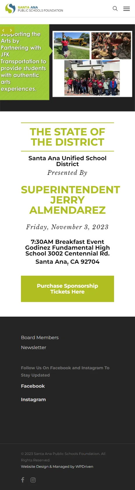
    Quick Answer: Santa Ana Public Schools Foundation is a nonprofit that was growing, but their website was not. We modernized the site with clearer storytelling, easier donation flows, and a mobile-first design that lets donors give in under a minute. The site loads in 0.9 seconds, and donations increased by 38%. This case study breaks down the problem, what we built, and why it works for nonprofits.


    For a nonprofit, a website has two jobs. It has to tell the story clearly enough that a visitor cares, and it has to make giving easy enough that they act on it. Most nonprofit websites do one of those well and the other badly.

    Santa Ana Public Schools Foundation’s site told the story, but it did not make giving easy. Donors who wanted to support the mission had to work to figure out how. That is a conversion problem, and it was costing the foundation donations every month.

    We modernized the site in a way that fixed both. Here is what changed, and why donations increased by 38%.

    If you want the full breakdown of what a nonprofit build like this costs, see our WordPress web design pricing.


    The problem

    Three issues stood out before we touched a single line of code.

    The donation flow was too slow. The old site had a donation page, but the flow to get there was not obvious. A donor who was ready to give had to find the donate button, navigate to a form, fill out multiple fields, and hope the payment worked. Every extra step loses donors. That is a well-documented pattern in nonprofit conversion data, and it was showing up in the foundation’s numbers.

    The story was not doing its job. A nonprofit’s website is a storytelling tool. Donors give because they believe in the mission. The old site told the story, but it was buried behind text-heavy pages and a layout that did not pull the visitor in. A visitor who does not feel the mission in 10 seconds will not scroll to find it.

    The site was slow on mobile. Most donors browse on their phones. The old site was built for desktop first, and the mobile experience was an afterthought. A slow or clunky mobile experience loses the donor who was ready to give right there.

    The result was a nonprofit with a website that looked like a nonprofit, and converted like one too.


    What we built

    We rebuilt Santa Ana Public Schools Foundation on WordPress. Here is what went into it.

    Clearer storytelling

    The new site leads with the story:

    • A hero section that says exactly what the foundation does and who it serves
    • Impact numbers on the homepage so donors can see what their giving supports
    • Clear story pages for the programs the foundation funds
    • Photography that connects the donor to the community being served

    This is the same story-first approach we use on every nonprofit website we build. For a nonprofit, the story is not decoration. It is the conversion engine.

    A mobile-first donation flow

    The new site was built around one goal: make giving easy in under a minute.

    • A visible “Donate Now” button on every page
    • A donation flow that asks the minimum necessary information
    • Multiple payment options (card, PayPal, Apple Pay)
    • A confirmation page that thanks the donor and shows the impact of their gift

    The donation flow is the heart of the site. Every other page exists to lead to it. That is what turned the donations around.

    A 0.9-second load time

    The new site loads in 0.9 seconds. That came from:

    • Compressed and properly sized images
    • A lightweight theme with no unnecessary plugins
    • Clean code with no render-blocking scripts
    • Caching and asset optimization configured correctly

    For a nonprofit, speed is not a luxury. It is the difference between a donor giving and a donor leaving. On mobile, a 3-second load time can lose more than half your visitors. A 0.9-second load time keeps them.

    A mobile-first design

    The site was designed for mobile first. The story pages read well on a phone, the donation flow works on a phone, and the impact numbers are visible without scrolling far. Every step was tested across devices before launch.

    A technical SEO foundation

    The new site has:

    • Clean heading hierarchy on every page
    • Schema markup for nonprofit organizations
    • Fast load times
    • Descriptive meta titles and descriptions
    • A structure that Google and AI assistants can read and cite

    That foundation is what makes the site visible in search before the donation even matters. See our SEO, AIO, and GEO services for what that looks like as an ongoing program.


    The result

    Here is what changed, measured against the original site.

    MetricBeforeAfter
    DonationsBaseline+38%
    Load timeSlow0.9 seconds
    PlatformLegacy buildWordPress
    Donation flowMulti-step, desktop-firstMobile-first, under a minute
    StorytellingText-heavyStory-first, impact numbers visible
    Mobile experienceFunctionalMobile-first

    What these numbers actually mean.

    • +38% donations means the foundation is now raising 38% more than they were before the rebuild. That is the number that matters most for a nonprofit — it is not a vanity metric, it is the mission.
    • 0.9s load time means the site loads before a donor can decide to leave. On mobile, that is the difference between a gift and a bounce.

    If you want to see the site live or walk through the data behind these numbers, get in touch and we will set it up.

    If you want to see how this compares to our other projects, the portfolio lists the results for every case study we publish.


    Why this matters for nonprofits

    Nonprofit websites are one of the most underestimated conversion channels in the sector. Most nonprofits treat their website as a brochure: here is our mission, here is our history, here is our board. That is not what donors are looking for.

    When someone lands on a nonprofit website, three things decide whether they give:

    1. Do they feel the mission in 10 seconds? A story-first hero section does that. A wall of text does not.
    2. Can they see what their gift supports? Impact numbers do that. A vague “support our work” message does not.
    3. Can they give in under a minute? A mobile-first donation flow does that. A multi-step form with 12 required fields does not.

    Santa Ana Public Schools Foundation now has all three. That is what a 38% donation increase looks like in practice.

    If you run a nonprofit and your site has any of the problems above, a free website health check will tell you exactly what to fix first.


    Frequently asked questions

    How long does a nonprofit website take to build?

    Most nonprofit websites take 5 to 10 business days from approval, depending on how many story pages and program pages you need and how quickly you provide content and photography. More complex builds with custom donation integrations take 2 to 4 weeks.

    How much does a nonprofit website cost?

    Most nonprofit websites start at $1,200 for a starter build with up to 5 pages, or $2,400 for a growth build with up to 10 pages including story pages, impact numbers, and a mobile-first donation flow. Custom builds start at $4,000. See the full breakdown on our website cost guide.

    Can my nonprofit website take donations automatically?

    Yes. Santa Ana Public Schools Foundation’s site uses a mobile-first donation flow that lets donors give in under a minute, with multiple payment options and a confirmation page. We can set up the same thing for your nonprofit.

    Do you build nonprofit websites on WordPress only?

    WordPress is our default for nonprofit websites because it gives you the best control over storytelling, donation flows, and SEO. We also build on other platforms when that is the right fit, and we will recommend the platform based on your goals, not our preference.

    Can you improve the conversion rate of my existing nonprofit website?

    In many cases, yes. Sometimes the fix is a clearer story-first layout and a better donation flow. Sometimes it is a full rebuild. A free website health check will tell you which path makes sense for your site.


    See what your nonprofit website could look like

    Tell us about your mission and what you want the site to do. We reply within 24 hours with a custom recommendation and a plan for a free demo. No obligation, no pressure.

    Get a free demo →

    Prefer to chat first? Message us on WhatsApp and we will reply during business hours.


    Related reading: